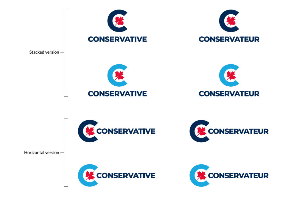
Erin O’Toole is making his mark as the new leader of the Conservative Party of Canada by launching the first re-design of the party’s logo and first significant brand redesign since the announcement of the then new party in late 2003.
The Conservative C has been made circular and the primary blue colour has been made darker. A lighter red maple leaf still adorns the centre of the logo but has been tilted 45° to the right. The party explains that this is reflective of O’Toole’s motto “through adversity to the stars”.
The logo and motto are evocative of O’Toole’s service in the RCAF. And friends and critics of the party were quick to point that out on twitter. Yet, it’s certain that the Conservative campaign will be highlighting O’Toole’s military service during the next election as Canadians consider the election of public servants during a national crisis.


The Conservative Party has adopted Lato, the open source sans serif font font from Google and designer Łukasz Dziedzic.
According to the style guide, the logo can also be presented in white on the primary colour backgrond.
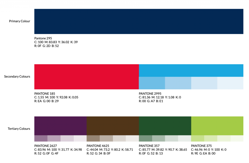
There’s also a tertiary colour set that the party will likely use in different contexts.

Conservative branding guru Dan Robertson gave direction for the rebrand to Seasoned, a design firm. The firm’s Daniel Charron did the heavy lifing on the logo design and style.
If you’d like to download the new style guide, it’s right here.
